Let the product sell
Use more real, close-up food content where the meal is the first thing people see and understand.
A short sample of how I would approach content for LC Big Mak Burger: protect what people already recognize, then make the food, people, branches, and community moments easier to feel online.
LC Big Mak is not starting from zero. It already has a memorable look, a strong value proposition, active branches, and real local presence. The opportunity is not simply making nicer graphics. It is showing more of the life already around the brand, then building a system that keeps that content moving.
Use more real, close-up food content where the meal is the first thing people see and understand.
Staff, customers, branches, events, and the mascot can make the page feel like part of everyday local life.
Customer offers and franchise enquiries need different messages, formats, and calls to action.
Content calendars, clear social-first captions, Canva-ready templates, post scheduling, and a small number of recognizable content series.
Branch and event content requests, asset folders, basic approval tracking, and a process for collecting usable photos and clips.
AI can help with first caption options, prompts, repurposing, and routine drafts. The team still checks the final message, offer, availability, and brand judgement.
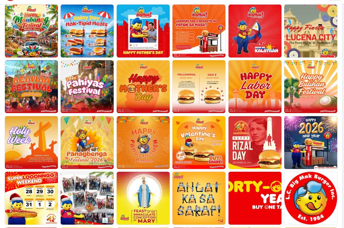
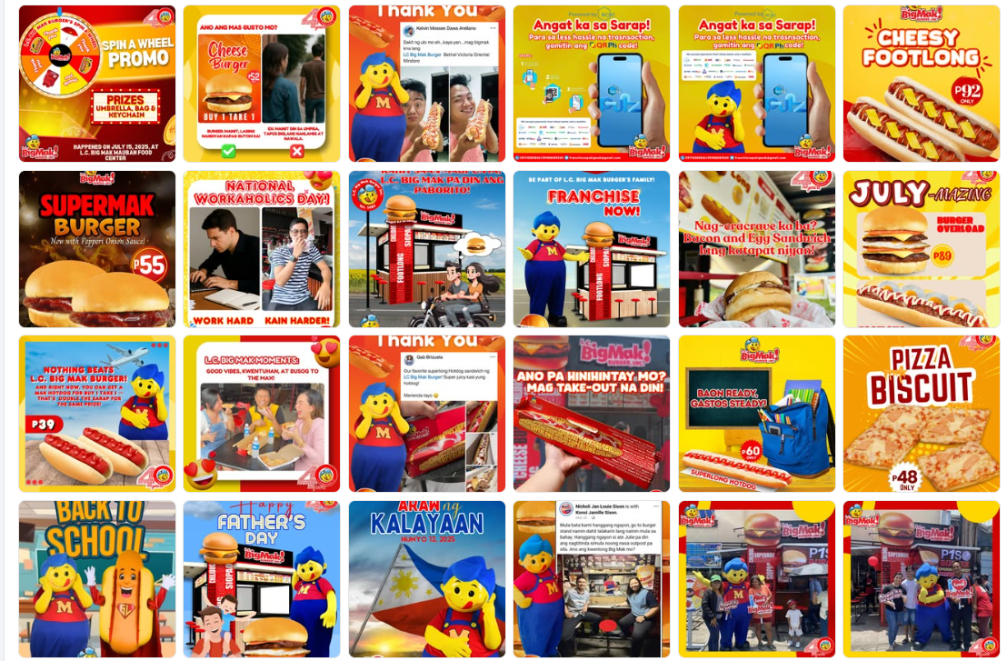
Some graphics prioritise type, illustration, or celebration over the burger itself. For a quick-service food brand, food texture, scale, freshness, and an easy-to-read offer should do the first job.
Festival greetings prove local presence. Add a branch cue, a product moment, a customer story, or an invitation so local pride becomes useful brand engagement instead of a standalone greeting.
Several captions restate the visual, use broad celebratory language, or rely on long hashtag lists. A sharper opening line, benefit, and call to action will be easier to read on mobile.
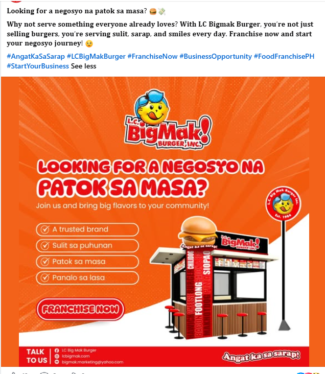
Someone deciding what to eat wants a menu, price, and nearby branch. Someone considering a franchise needs proof, investment context, and a low-friction enquiry route. Treat these as different audiences.
Close-up, real-looking food photography or focused product renders. One hero item, one reason to want it now.
Bundles, meal combinations, and limited offers with an uncluttered price hierarchy and clear availability.
Families, students, staff, mascot appearances, and customer reactions that make the brand feel lived-in.
Branch openings, festivals, and local stories, always paired with a food, branch, or participation cue.
A separate, credible series with operator proof, location potential, enquiry CTA, and a dedicated lead path.
The job is not to make every post look good in isolation. It is to show the everyday life around LC Big Mak in a consistent, social-first way: real cravings, crew opinions, after-school stops, local weather, branches, and moments people want to send to a friend. The visual system keeps the page recognizable. The stories give it a reason to exist.
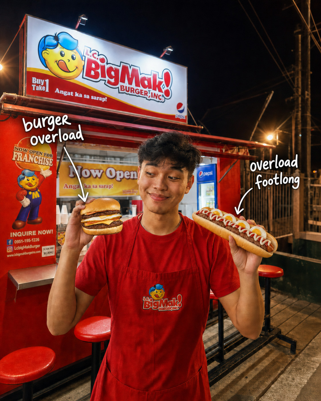
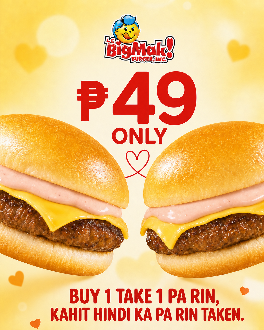
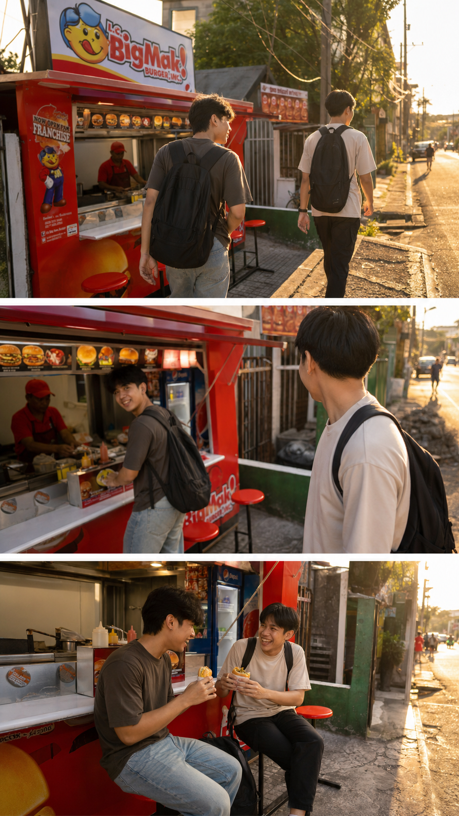
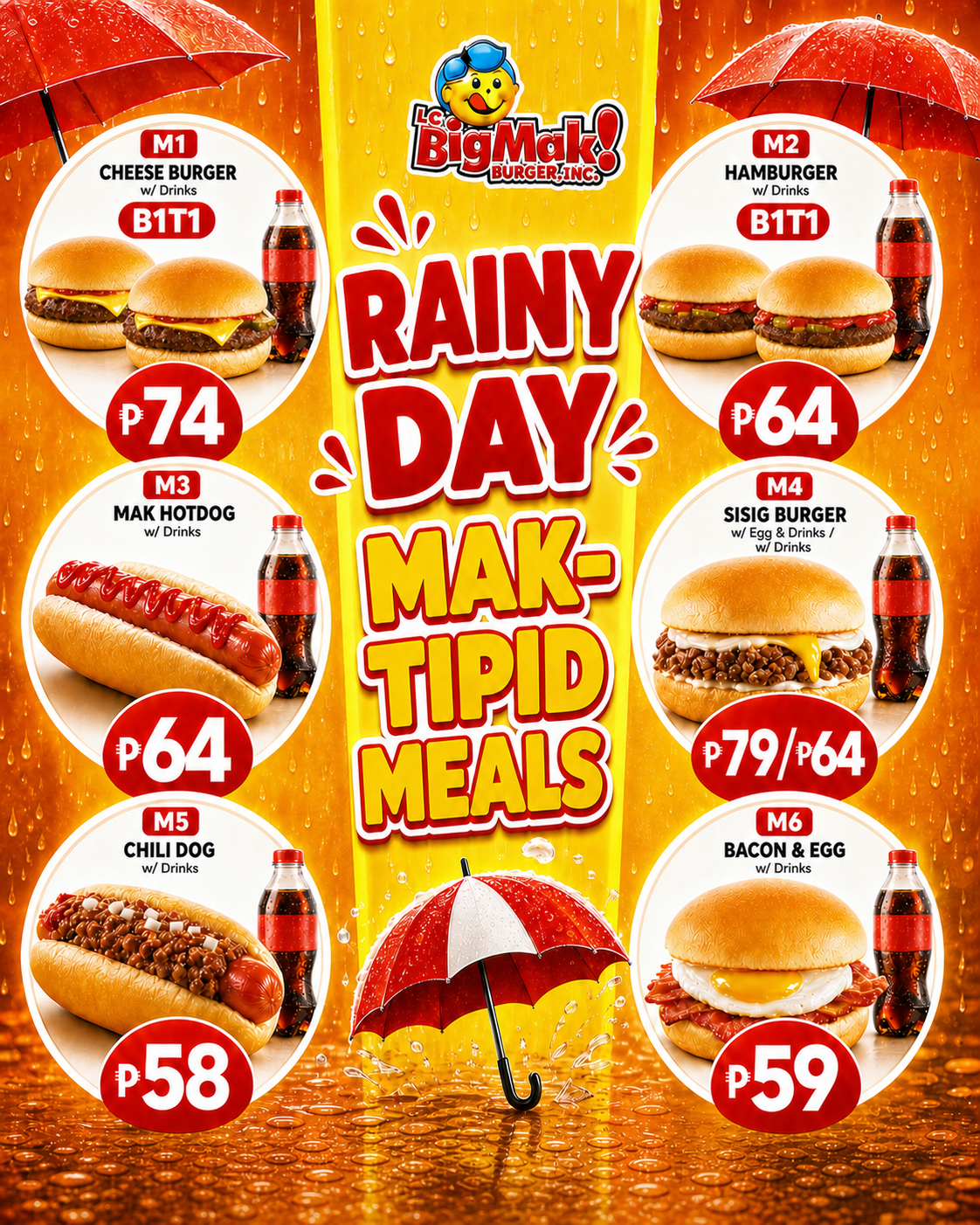
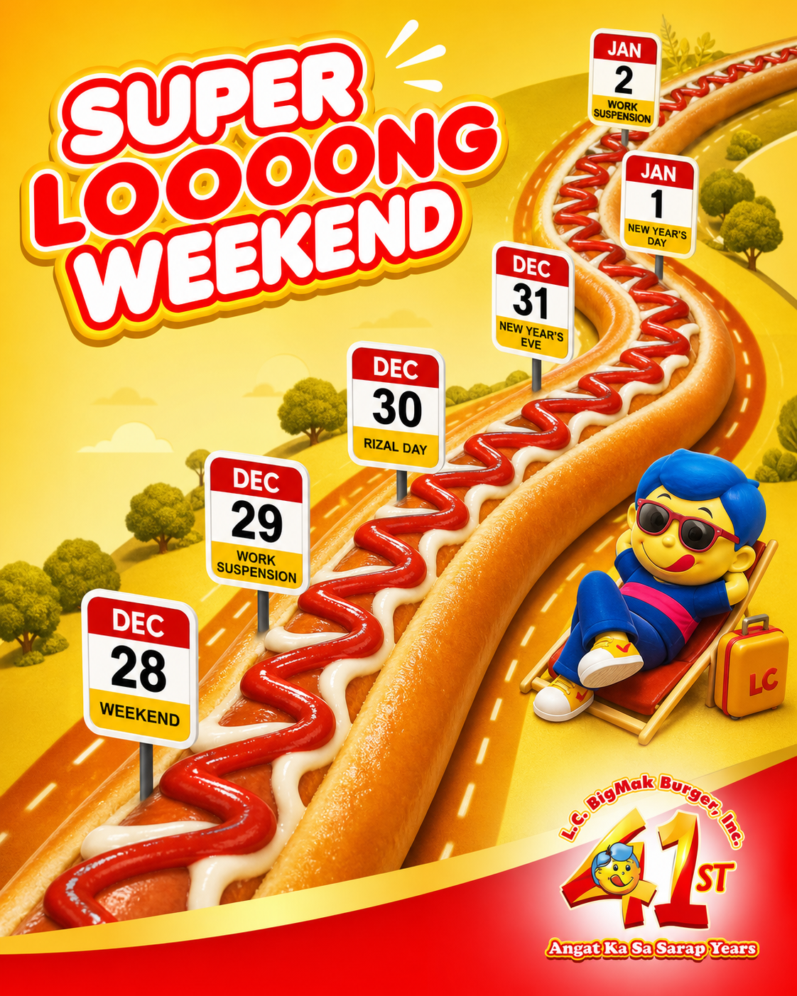
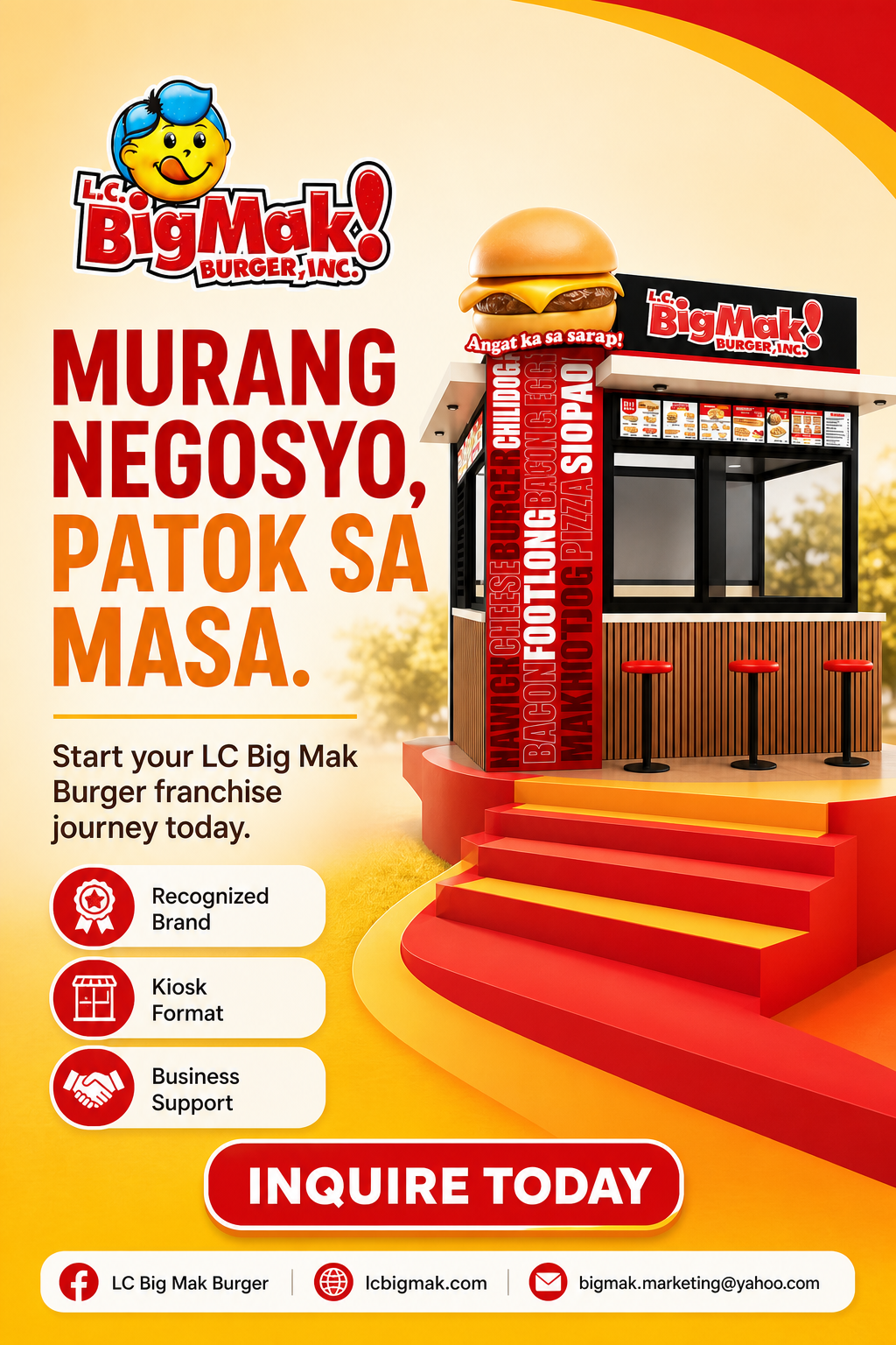
Concept visuals only. Prices, offers, product availability, dates, and franchise information should be confirmed with the team before anything is published.
These are not claims of guaranteed performance. They show how the same kinds of messages can move from one-off graphics to content with a clearer job, a social idea, and a recognizable place in the LC Big Mak feed.
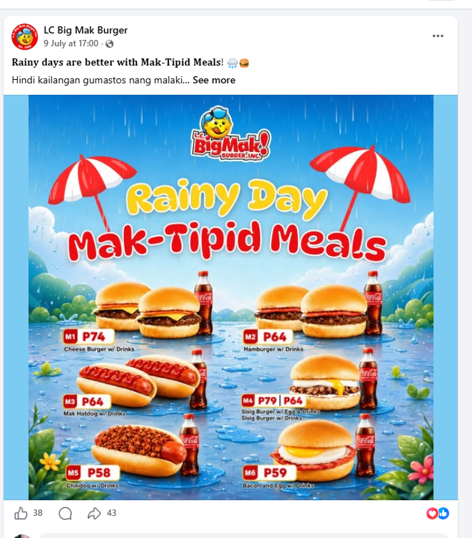
Current format: the meal options, prices, weather scene, mascot, and decoration all compete for attention. The offer is present, but it takes a moment to scan and does not establish a repeatable visual pattern for future meal posts.
Proposed shift: keep the rainy-day mood, but give each meal a clearer space and a more deliberate information order. Reusable colour cues, logo placement, food treatment, and type hierarchy make the post easier to read and help it feel connected to the broader LC Big Mak feed.
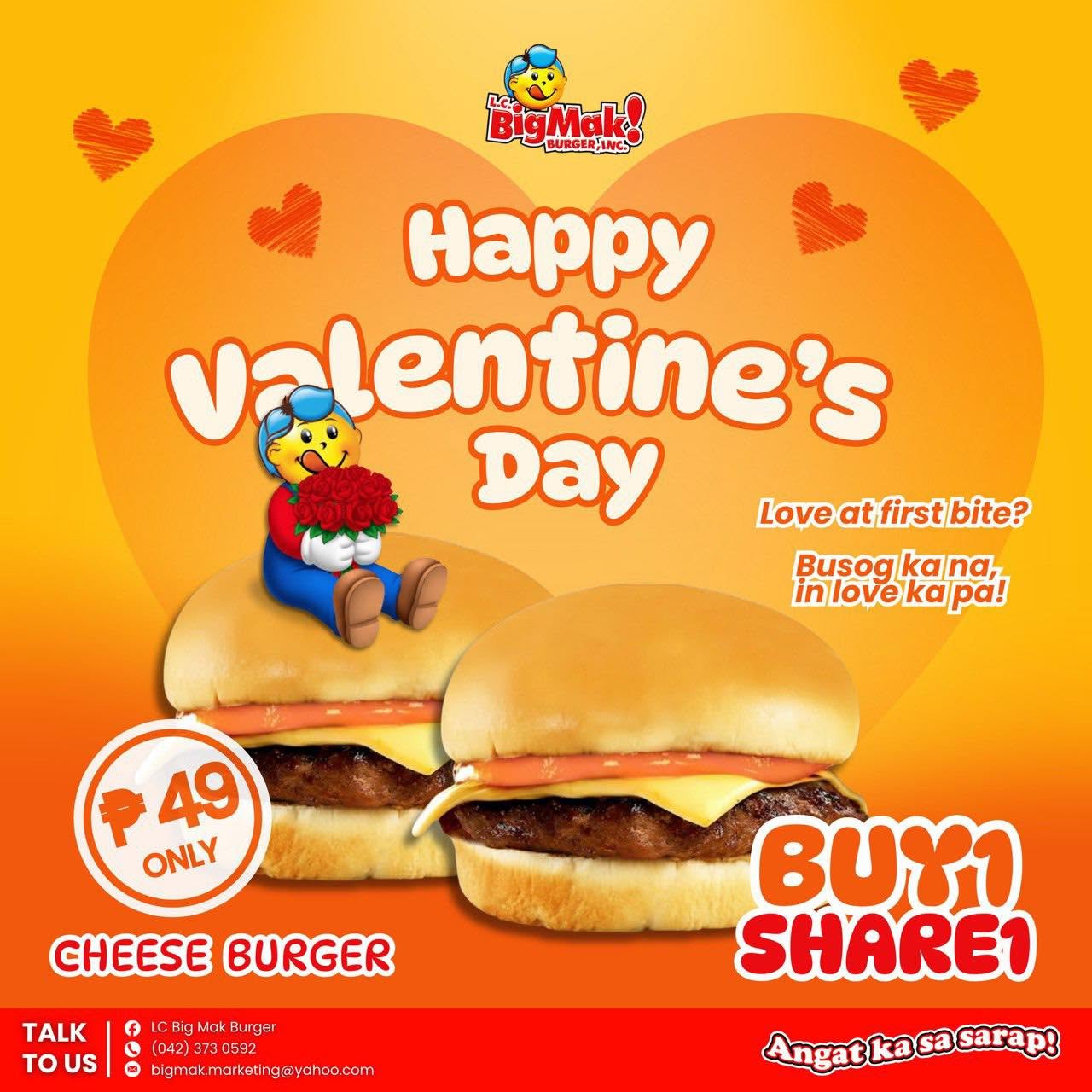
Current format: the Valentine's message, price, burgers, and Buy 1, Share 1 line are all clear. But the post does not create much of a situation people can see themselves in or respond to with a tag, comment, or share.
Proposed shift: turn the deal into a small social moment. The visual shows the offer; the caption adds the human beat: "send this to the friend na laging one bite lang." That pairing can spark an actual reaction while still carrying the same value message.
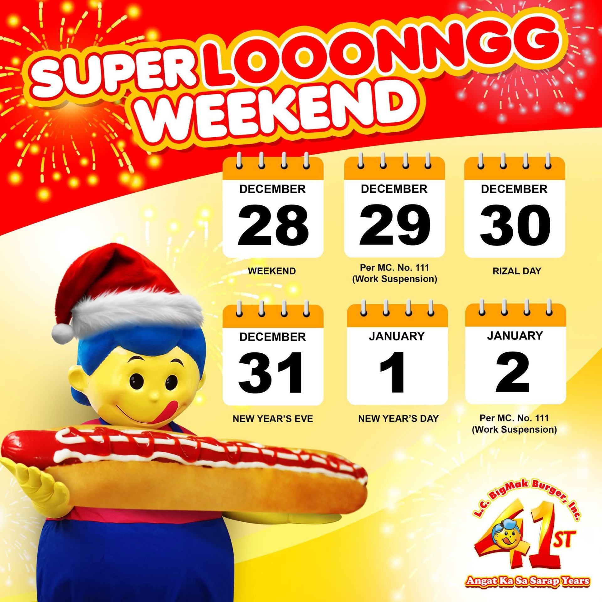
Current format: the dates are useful, but the long weekend is the entire visual focus. The footlong and food occasion are secondary, so the post works more as a public-service announcement than a food-brand post.
Proposed shift: use the calendar as the story trigger, then make the product the hero. The footlong becomes part of the long-weekend idea itself, so people understand the occasion and feel the craving in the same glance.
Current format: it asks for enquiries clearly, but the value proposition is spread across broad claims such as trusted brand, sulit sa puhunan, and patok sa masa. A prospective franchisee still has to work out what is actually being offered.
Proposed shift: show the business opportunity, then organise the proof points around it: an established brand, kiosk format, and business support. The visual carries a clearer offer, while the caption can begin with a familiar local opportunity and direct serious leads to the right enquiry path.